Python之openpyxl插入折线图方法
小P
2020-10-29 17:57:547527浏览 · 0收藏 · 0评论
其实在openpyxl中也是可以用来做折线图的,是不是很有意思呢?今天就让我们一起来试试吧。
代码如下:
import os
import openpyxl

from datetime import date
from openpyxl import Workbook

from openpyxl.chart import (
 Series,
 LineChart,
 Reference,
)
def add_line_chart(title, wss, min_col, min_row, max_col, max_row):
 c1 = LineChart()
 c1.title = title # 图的标题
 c1.style = 12 # 线条的style
 c1.y_axis.title = 'percent' # y坐标的标题
 if 'IDC' not in title:
  c1.x_axis.number_format = 'd-mmm' # 规定日期格式 这是月,年格式
  c1.x_axis.majorTimeUnit = "Months" # 规定日期间隔 注意days;Months大写
 c1.x_axis.title = "Date" # x坐标的标题
 data = Reference(wss, min_col=min_col, min_row=min_row, max_col=max_col, max_row=max_row) # 图像的数据 起始行、起始列、终止行、终止列
 c1.add_data(data, titles_from_data=True, from_rows=True)
 dates = Reference(wss, min_col=2, min_row=1, max_col=max_col)
 c1.set_categories(dates)
 wss.add_chart(c1, "A6") # 将图表添加到 sheet中


def save_data_to_excel(file_name, target_sheet_name):
 select_cursor = connect.cursor()
 select_sql = "select phone_company, record_date, record_percent from phone_statistics where record_company = '%s'" % target_sheet_name
 if target_sheet_name == "IDC":
  select_sql = "select phone_company, record_q, record_percent from phone_statistics where record_company = '%s'" % target_sheet_name
 select_cursor.execute(select_sql, ())

 data_dic = {}
 all_date = {}
 all_phone_company = {}
 for item in select_cursor:
  if target_sheet_name == "IDC":
   data_dic[item[0] + '_' + item[1]] = item[2]
  else:
   if type(item[1]) == str:
    data_dic[item[0] + '_' + item[1]] = item[2]
   else:
    data_dic[item[0] + '_' + item[1].strftime("%Y-%m-%d")] = item[2]
  all_date[item[1]] = 1
  all_phone_company[item[0]] = 1

 if os.path.exists(file_name):
  wb = openpyxl.load_workbook(file_name)
 else:
  wb = Workbook()

 try:
  wb.remove_sheet(wb['Sheet'])
 except Exception as e:
  pass
 try:
  wb.remove_sheet(wb[target_sheet_name])
 except Exception as e:
  pass

 try:
  sheet = wb[target_sheet_name]
 except Exception as e:
  sheet = wb.create_sheet()

 start_date_index = 'B'
 for each_date in all_date.keys():

  if target_sheet_name == "IDC":
   sheet['%s1' % start_date_index] = each_date
  else:
   if type(each_date) == str:
    sheet['%s1' % start_date_index] = each_date
   else:
    sheet['%s1' % start_date_index] = each_date.strftime("%Y-%m-%d")
  start_date_index = chr(ord(start_date_index) + 1)

 start_name_index = 2
 for each_name in all_phone_company.keys():
  sheet['A%d' % start_name_index] = each_name
  start_name_index += 1

 start_date_index = 'B'
 start_name_index = 2
 for each_date in all_date.keys():
  for each_name in all_phone_company.keys():

   if target_sheet_name == "IDC":
    key = each_name + '_' + each_date
    if key in data_dic:
     sheet['%s%d' % (start_date_index, start_name_index)] = data_dic[key]
   else:
    if type(each_date) == str:
     key = each_name + '_' + each_date
    else:
     key = each_name + '_' + each_date.strftime("%Y-%m-%d")
    if key in data_dic:
     sheet['%s%d' % (start_date_index, start_name_index)] = data_dic[key]
   start_name_index += 1
  start_date_index = chr(ord(start_date_index) + 1)
  start_name_index = 2

 sheet.title = target_sheet_name
 sheet.column_dimensions['A'].width = 20
 start_date_index = 'B'
 for each_date in all_date.keys():
  sheet.column_dimensions[start_date_index].width = 13
  start_date_index = chr(ord(start_date_index) + 1)

 add_line_chart(target_sheet_name.upper() + "'s Phone Statistics", sheet, 1, 2, len(all_date.keys()) + 1,
     min(15, len(all_phone_company.keys()) + 1))

 wb.save(file_name)
 pass
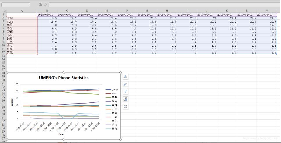
成果:
补充知识:python plotly line chart 折线图
# 1 折线图数据
# trace1 - 基本格式
# trace2 - 更多参数
trace1 = go.Scatter(
 x = x1,
 y = y2,
)
trace2 = go.Scatter(
 x = x2,
 y = y2,
 mode = 'lines', # 模式:lines 线,markers 点。可用“+”相连
 name = 'line2', # 折线名,显示于图例
 connectgaps = True # 连接缺失点两端 默认False
 line = dict(
  color = ('rgb(205, 12, 24)'), # 颜色
  width = 4, #线宽
  dash = 'dash') # 虚线: dash 一一,dot ···,dashdot 一·一
)
)

# 2 打包数据
data = [trace1,trace2]

# 3 格式
layout = dict(title = '折线',
    xaxis = dict(title = '时间'), # 横轴坐标
    yaxis = dict(title = '数量'), # 总轴坐标
    legend=dict(x=1.1,y=1) # 图例位置
    )

# 4 打包数据+格式
fig = dict(data=data, layout=layout)

# 5 画图
py.iplot(fig, filename='styled-line')
以上这篇openpyxl 插入折线图的方法已经分享给大家了,更多Python学习推荐:PyThon学习网教学中心

关注公众号,随时随地在线学习
相关文章

 分享到微博
分享到微博 微信扫一扫
微信扫一扫
 流芳
流芳


 6228
6228